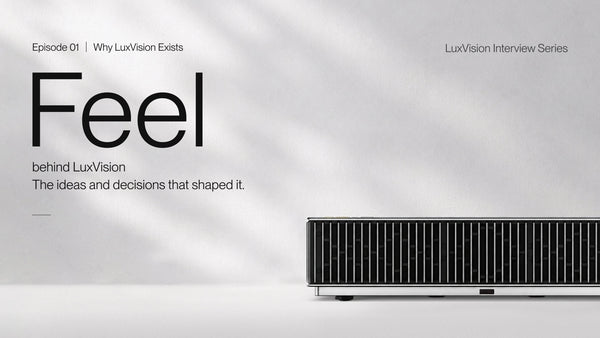













Feel · Behind LuxVision | The Design Behind AWOL LuxVision
Meet Elon

Elon
Senior Industrial Designer · LuxVision Core Design Lead
5 Years in Projection & Home Entertainment · 3 Years in Projection
At AWOL Vision Since 2023
A projector is usually designed around what happens on the screen. But for Elon, that is only part of the story.
As the core designer leading LuxVision’s industrial and product design, he approached Lux from a different starting point: What should a projector feel like when it becomes part of the home?
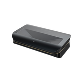
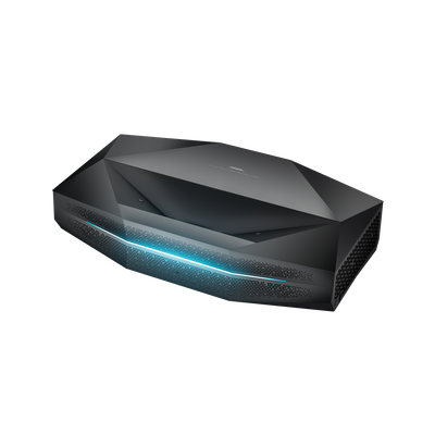
LuxVision was never intended to be simply another piece of AV equipment. It was designed around the idea that a product can have its own presence without taking over the space, and that technology can become part of the way a home looks, feels, and is experienced.
That thinking is captured in one simple idea: Designed to Define the Space.
Designing a Projector Like a Part of the Architecture
When Elon and the design team began shaping LuxVision, they were not looking for a decorative style that could simply be applied to the outside of a projector. They wanted the product's proportions, materials, and visual language to feel intentional from the beginning.
One of the strongest references came from classical Greek architecture, particularly the columns of the Parthenon.

The inspiration was not about copying an ancient architectural element. It was about understanding why certain proportions continue to feel balanced and timeless. The relationship between columns, structure, rhythm, and proportion became a starting point for LuxVision's design language.
That idea led to a distinctive interpretation of the column as a visual element. The vertical structure was simplified and transformed into a recognizable design detail, giving the product a sense of order and architectural presence.
For Elon, this was important because LuxVision needed to feel different from a conventional electronic device
“We want Lux to have the sense of volume and presence of architecture — substantial, solid, and structured, with a sense of proportion that can stand the test of time.”
The result is a design that does not rely on excessive decoration. Its character comes from proportion, structure, and the relationship between different materials.
That restraint is deliberate. LuxVision is designed to remain visually relevant even after the first impression has passed.
Three Expressions, One Idea: Let the Home Lead
A premium projector rarely exists in isolation.
It sits in a living room surrounded by furniture, lighting, wood, stone, textiles, and personal objects. The same projector can feel completely different depending on the space around it.
That was one of the reasons LuxVision was developed in three distinct finishes.

Rather than treating color as a simple cosmetic choice, the design team looked at different interior styles and considered how the projector could participate in them without feeling out of place.
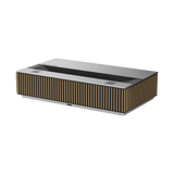
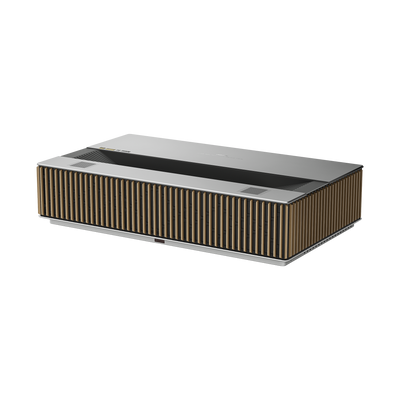
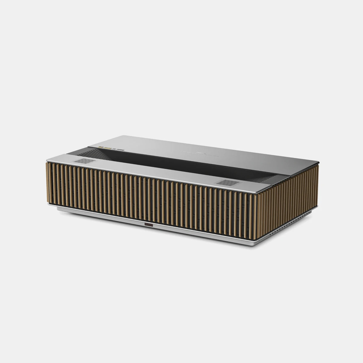
The Silver + Natural Oak combination uses silver metal and natural oak to create a lighter, more Scandinavian-inspired expression. The natural wood brings warmth to the technical form, making the product feel closer to contemporary furniture than traditional electronics.
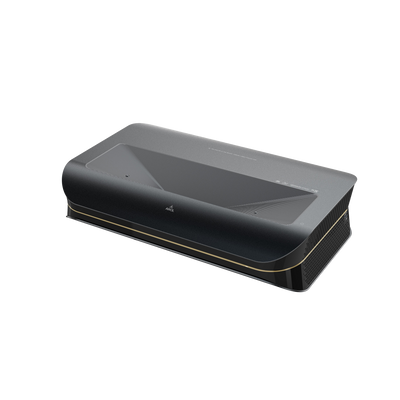
The Gold + Walnut version takes a more mature and classic direction. North American walnut paired with gold metal creates a deeper visual character, designed for spaces that favor richer materials, vintage references, and a more timeless aesthetic.
The Silver + Silver version is the most modern and restrained of the three. With a monochromatic silver treatment, it emphasizes technology, precision, and a contemporary visual language.
The three versions are different, but the principle behind them is the same: LuxVision should adapt to the home, rather than asking the home to adapt to the projector.
For a product that can become a significant visual element in a living room, that distinction matters.
The goal was not simply to give users more colors to choose from. It was to give different homes a version of LuxVision that feels naturally connected to the space.
When Materials Become Part of the Experience
The design philosophy continues beyond shape and color.
For LuxVision, Elon and the team deliberately chose materials that could communicate their qualities through both sight and touch.
The wood elements use natural wood rather than a painted imitation. They are polished and finished with wood wax oil to preserve the natural grain while providing protection. The metal elements go through multiple processes including polishing, stamping, and electroplating to achieve the final appearance.
But one of the most demanding choices is found in the treatment of the aluminum components.
LuxVision uses an ultra-fine sandblasted anodized finish, with 180- and 200-grit processing designed to create a particularly refined texture. This type of surface treatment is more commonly associated with premium consumer electronics than with projector products, and it places unusually high demands on manufacturing consistency.
The reason is simple: when the surface becomes more refined, imperfections become harder to hide.
A small material defect that might disappear under a conventional finish can become immediately visible after fine surface treatment. That means tighter process control, lower tolerance for imperfections, and significantly greater pressure on the supply chain.
For a smaller-volume product, choosing such a process is not necessarily the easiest commercial decision.
But the design team considered the first physical interaction with the product part of the overall experience.
The idea is that quality should not only be visible from across the room. It should also become apparent when someone gets close enough to see the texture, touch the surface, and notice the details.
The screen creates the visual experience. The product itself should create a different kind of experience before the screen even turns on.
Why Is LuxVision a Box?
At first glance, a box-shaped projector may seem like an obvious choice. For Elon, however, the form is the result of several different decisions coming together.
The first is engineering.
Projector components naturally create constraints around the shape of the product. Lenses, speakers, PCBs, batteries, thermal components, and other internal structures each occupy space in different ways, but many of these components are fundamentally based on circular or planar geometries.
A rectangular enclosure provides an efficient way to arrange and stack those components, allowing the team to pursue greater performance without unnecessarily increasing the overall volume.
But engineering efficiency alone does not explain the final form.
The second consideration is architectural presence.
The team wanted LuxVision to feel substantial and grounded rather than thin, fragile, or overly decorative. Its volume is intentional: a solid form with enough visual weight to become part of the room.
That is where the architectural inspiration comes back into the story.
The vertical elements inspired by classical columns were developed into a recognizable part of AWOL's design language. At the same time, the grille and metal-strip elements inherited from Valerion were refined and evolved for LuxVision.
Rather than starting from zero with every product generation, the design team wanted to establish continuity — a visual language that could become increasingly recognizable over time.
This is how LuxVision's industrial design moves beyond simply answering the question of “What should a projector look like?”
It begins to answer a larger question: “What should an AWOL product feel like in a home?”
A Presence Without Taking Over the Room
For Elon, integrating LuxVision into the home was never about making the projector disappear completely.
A product with this level of visual presence should be allowed to exist as an object in its own right. But it also needs enough restraint to coexist with the furniture and architecture around it.
That balance shaped the three finish options, the proportions, the material choices, and even the level of visual detail.
LuxVision can become a visual focal point when the space calls for it. At the same time, its restrained proportions and material combinations allow it to sit naturally within a larger interior composition.
In other words, the goal was not invisibility.
It was belonging.
The projector should be able to define part of the space without fighting the space for attention.
“We spent a lot of time solving these details because we wanted Lux to be more than a device. It should have a presence of its own, while still integrating into the space and expressing the owner's taste.”
That idea is particularly important for an ultra-short-throw projector, because unlike a traditional projector that may sit discreetly at the back of a room, an UST projector occupies a visible position close to the screen and often becomes part of the living room's central composition.
Its physical presence therefore matters almost as much as its technical role.

Designing for What Lasts Beyond the First Impression
There is a temptation in product design to add more details to make a product appear more premium.
Elon sees it differently.
The more information a product communicates visually, the more quickly it can become tiring. For LuxVision, the design team wanted to pursue a more controlled language — one that could make an immediate impression without becoming overwhelming over time.
That is why the product avoids unnecessary visual complexity.
Its personality comes through proportion, material, texture, and carefully controlled details rather than decoration for decoration's sake.
The ambition is not simply to make LuxVision look good in product photography. It is to create something that continues to feel appropriate after months or years of living with it.
Good design should survive the first impression.
That is also why Elon describes LuxVision not simply as an industrial product, but as something closer to an object of art.
Not because it is meant to sit apart from everyday life, but because it is designed to have meaning within it.

More Than a Projector
For Elon, the final measure of LuxVision's design is not whether someone can identify its materials or recognize its architectural references.
It is whether the product creates a connection between the image on the screen and the room around it.
The screen is where the content lives. The room is where people experience it. LuxVision sits between the two.
That is why the design philosophy ultimately comes back to one idea: Designed to Define the Space.
LuxVision is designed to have weight without feeling heavy, character without becoming loud, and sophistication without unnecessary complexity.
It should be something you notice when you enter the room, something that belongs when you live with it, and something that continues to reveal its details over time.
For Elon, that is the point where industrial design becomes more than industrial design.
It becomes the connection between technology, image, and home.
And that is where LuxVision's story continues. What happens when all of this design meets the technology inside? The next chapter looks beyond what LuxVision looks like — and into how the team turns its technical ambitions into an experience users can actually feel.
Be the First to Know
Subscribe for special deals, news, and important product information, and get your exclusive $100 discount.
Related Articles
Feel · Behind LuxVision | Behind AWOL LuxVision’s Picture Quality